
∀ei ∈ Sn C(ei, Sn\ei) = Cmax (Sn)
What is the mechanism of the harmony phenomenon?
How does harmony matter to beauty?
What criterion can be more objective than taste?
What is visual sensitivity?
These are the questions we will attempt to address in the following text.
What is the composition of a painting? It is all that remains once we leave out the style (or painterly conventions) and the content with the associated cultural and emotional context. Composition is the purely visual interplay of elements which make up a painting. A high quality composition is most difficult to achieve in art creation and highly challenging for viewer appreciation. Managing the interplay between elements to achieve the state where any perceptible change reduces the overall aesthetic value of the whole, requires an extraordinary ability to perceive relations between forms. Throughout art history only very few artists had the skill to succeed in this quest, and ever fewer audience members appreciated that skill.
The following text does not aim to popularise knowledge of proper composition construction. Instead, it is aimed at those who, being engaged in the creation or evaluation of paintings of any type, already noticed that composition matters and would like to explore its mechanism.
Much has been and still is written on visual perception, yet so far nobody has looked into analysing harmony as a state where any change reduces the expression of the whole. Rudolf Arnheim1 most insightfully described the impact of various relations between forms on the viewer’s emotions. The division of a surface, balance, weight, perception of forms as parts of a whole, spatial perception, or deformation, are just some of the many visual phenomena he analysed. Yet these are merely tools available to artists in their struggle to control the expressive power of their works. This expression, the aesthetic expression of the whole, is itself governed by a law or a mechanism which is explored in our research. Max Wertheimer2 and others developed their Gestalt theory based on the phenomenon of holistic perception they observed – the mind’s tendency to instinctively combine elements into commonly known or expected forms. But its similarity to the presently explored issue is illusory, following merely from the use of the terms ‘part’ and ‘whole’. In our case the whole is simply the entire painting – the complex structure composed of smaller parts is a painting, not a commonly known or expected simple form. Naturally, there are artists who do use deformations and simplifications in representing commonly known forms, thus using what the Gestalt theory teaches us about perception, but as I mentioned above, this need not have any bearing on whether they thereby create what I call a harmonious composition.
One of the most renowned cultural scholars, Ernst Gombrich3, writes on that topic: “What an artist worries about as he plans his picture, makes his sketches, or wonders whether he has completed his canvas, is something much more difficult to put into words. Perhaps he would say he worries about whether he has got it “right”. Now it is only when we understand what he means by that modest little word “right” that we begin to understand what artists are really after. […] When it is a matter of matching forms or arranging colours an artist must always be “fussy” or rather fastidious to the extreme. Moreover, his task is infinitely more complex than any of those we may experience in ordinary life. He has not only to balance two or three colours, shapes or tastes, but to juggle with any number. He has, on his canvas, perhaps hundreds of shades and forms with he must balance till they look “right”. A path of green may suddenly look too yellow because it was brought into close proximity with a strong blue – he may feel that all is spoiled, that there is a jarring note in the picture and that he must begin it all over again. He may suffer agonies over this problem. He may ponder about it in sleepless nights; he may stand in front of his picture all day trying to add a touch of colour here or there and rubbing it out again, though you and I might not have noticed the difference either way. But once he has succeeded we all feel that he has achieved something to which nothing could be added, something which is right – an example of perfection in our very imperfect world.”
Richard Woodfield “The Essential Gombrich” 1996 Phaidon
To explain the mechanism of harmony, we need to begin by clarifying some of the terms we will need. Let’s start from what I will call an ‘element of a composition’, its basic constituent part. As we stand at a comfortable distance from an object, not too close but not too far away, just as we intuitively would when wanting to perceive and evaluate something as a whole, our sense of sight will only deliver a small portion of our visual field in full sharpness, but our peripheral vision will allow us to comprehend the whole. We can then stipulate that the basic elements which contribute to the composition are places which we perceive as or feel to be relatively homogenous and bordering on places perceived as different, or simply: places which are visually different from their surroundings. It is important to note that the surroundings are themselves elements.
Now let’s turn to the most important tool in an artist’s toolbox: juxtaposition. This meeting of at least two elements which through interaction create an impression that is different from that created by either of them separately, is a basic device of artistic expression. Since we defined harmony as a state in a painting’s composition where any change will lead to a decrease in the aesthetic value of the whole, juxtapositions in a composition will need to be subject to some specific criteria – ones different from those which apply to compositions lacking in or enjoying only partial harmony. Here the phenomenon of limited extremes enters the stage. We are definitely dealing with extremes as the compositions we are investigating are those that cannot be improved, i.e. are extremely harmonious.
Any intermediary states which can achieve the extreme state are inseparably linked to some kind of transformations. There is an infinite number of those possible in the case composing from visual elements, but only one can be common to all compositions. This is the transformation of the relation of similarity between elements, or the level of dissimilarity, or simply: contrast.
The literature on visual perception describes many types of relations between forms: balance, element grouping, rhythm, or the way shapes influence each other. We will focus on something that could be called a common denominator, or more precisely: a common reason behind all those relations. This is simply the difference in appearance. The specific features or combinations of features which differentiate forms are mostly irrelevant in explaining the mechanism of harmony. Human mind deals with all this in split seconds without a need for explicitly attending to those details.
Any excitation of the senses and the experiences thus produced are only possible through changes in stimuli. Differences between phrases in a musical work or areas on the surface of a painting are what makes such experiences possible. In contrast, consider looking at a wallpaper covered with a uniform, repetitive pattern, or listening to a clock ticking. As I mentioned above, a juxtaposition of two different elements creates an impression that is unlike the impression created by either element alone. This impression becomes stronger as the level of dissimilarity between those elements rises. That is the effect of enhancing the visual properties of one element by the otherness of the other.
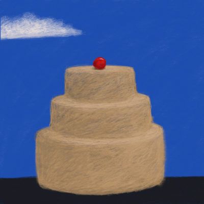
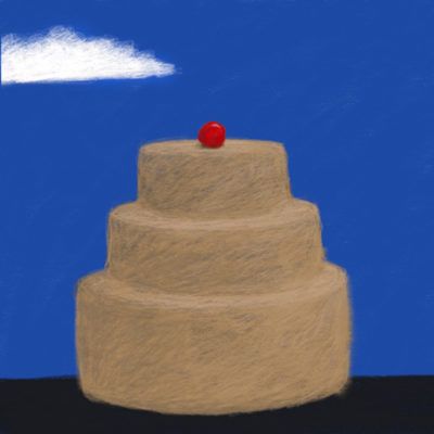
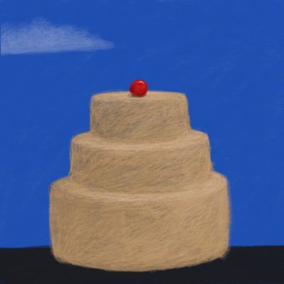
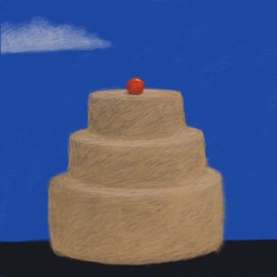
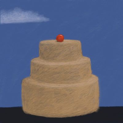
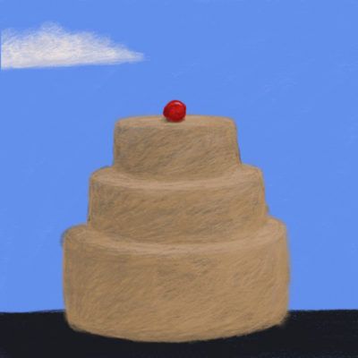
A perfect example of this phenomenon is a cherry adorning a cake. Let’s say that a beige, matte Pavlova (meringue cake) is topped by a much smaller, glossy, red cherry. The question is: can this juxtaposition be any more contrasting? This seemingly naïve comparison is quite effective. Imagine for example an apricot: it is less contrasting, as its surface is matte and its colour closer to that of the Pavlova. If we replace it with a redcurrant which is even smaller and thus might seem better than the cherry, we will soon find that when seen from a somewhat greater distance it simply disappears. Similarly, should we place a diamond necklace on a grey-white checkered fabric, it will stand out less than against a background of black or red velvet. A talented artist can match any form or group of forms with another, different in a way which will best bring out their properties.
One could ask: why do this? The eye is naturally drawn to difference, and thus increasing the impact forms have on one another is the basic, or perhaps the only way to achieve expression in a painting, to distance it from the wallpaper. Many might find this much quite obvious, but the key to understanding the mechanism of complete harmony is in understanding what should the relations between all forms and elements in a painting be. Since we already established that the only candidate is the relation of the level of contrast, what remains is specifying what this level should be. Imagine a painting representing, in any artistic style, a part of a beach – just sand. The multiple sandy folds are all alike and rather boring to look at. Our eyes slide across the painting stopping here and there in places where light and shade meet on one of the monotonous folds. The task is to increase the expressive power of the painting by diversifying it. Let’s throw in a stone. Now our eyes immediately focus on wherever the stone is, as it is different from its surroundings. We will look at the stone and occasionally glance at the sand. Here, one of the much discussed phenomena in visual perception can be observed. Should we place the stone in the very middle of our rectangular painting, we will find it less attractive than when we move it a bit to the left or right. The most attractive spots turn out to be on the lines of the so-called golden ratio, where the painting is divided in the most impactful way. The shorter section will have the smallest length that doesn’t became so small as to become dominated by the longer one – which would be similar to what happened to the redcurrant as we looked at the Pavlova from a distance. Should we further move the stone up or down in the same proportion, we will achieve the most diverse division of the painting. The distance between the stone and each edge will be different. This will catch our attention, as we focus not only on the stone, but also intuitively compare the distances and sizes of the fields which appeared as we divided the painting.
This was a step towards harmony, but we are still far from a state where our eyes would meet enough diversity to draw our attention for longer. If we add another stone, we can draw on our experience and make sure it is different: bigger, smaller, of a different colour. But even if we find a place where it will again divide the surface in the most interesting way, all we will achieve is a slightly more interesting composition. We are still far from complete harmony, the state where any change can only make things worse. We can add more and more stones of various kinds, even throw in shells and sticks, but soon we’ll notice that although we might enrich the painting’s structure, slowly our eyes become lost and confused in the clutter of quite similar forms, and even the now minimally differentiated patches of clear sand stop drawing our attention. To excite our eyes to explore the painting again, we decide to add something completely different: our child’s red sand bucket. As it turns out, wherever we place it, it is so different from the other forms that its impact will be the same as that created before by adding the first stone. We focus on the bucket and only skim the rest. What happened? Turns out that by adding the bucket we crossed some threshold. The form contrasted too strongly with the rest of the composition and diverted our attention. It diminished the impact of those contrasts which existed between the other forms. To a varying degree, this is a rather common mistake in imperfect compositions.
This thought experiment with sand and various objects can be rather easily adapted to any imagined or even actual experiences with representational or abstract compositions. It demonstrates that creating a harmonious composition is a game of differences, or contrasts which attract our eyes and elicit pleasurable emotions. Initially, one could think that virtually any part of any painting looks different than other parts, and thus should satisfy our criteria and give us pleasure. But the essence of, and the difficulty in creating complete harmony is in ensuring that all parts are maximally dissimilar but do not cross the threshold pre-conceived for the entire composition. This is the limited extreme I mentioned before. The threshold is determined by the artist at a desired level. It will be different for a delicate black and white sketch, and different for a colour oil painting – and not necessarily higher for the latter.
Below is a simple five-element composition which exemplifies changes in the perception of relations between forms following manipulations of the level of maximum contrast.


The notion of the level of contrast is intuitively simple when dealing with two elements, for example comparing the contrast between a circle and an ellipse, and the contrast between a circle and scissors. It is infinitely harder to imagine the contrasts between complex forms composed of multiple elements contrasting with other complex forms. But once we are faced with a complete painting, this becomes considerably easier. Exceeding the pre-conceived level of maximum contrast for the composition in one place will divert our eyes from other places, while not reaching this level in another place will decrease its ability to attract our eyes. Logically, there is only one path we can follow: we need to ensure that the level of contrast between all forms in a painting is equal. We must add, subtract, or change elements in a way which will make each place look different from others, but no place look more different from others than any place does from the whole. We must also ensure that no place is less contrasting with the rest, as this will leave space for improvements, for introducing more interesting contrasts. One can better appreciate just how hard this is, when realising that every element of a harmonious, un-improvable composition must be contrasted with all the other forms not only to the same degree, but also, just as the cherry on the cake, maximally. In short, this is evenly distributed maximum diversity. This is what I call dynamic equilibrium, or the perfect equilibrium of maximum differences.
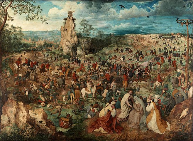

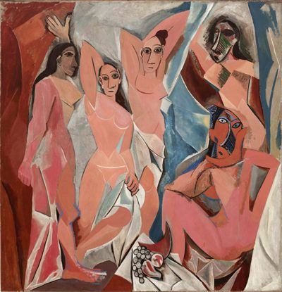
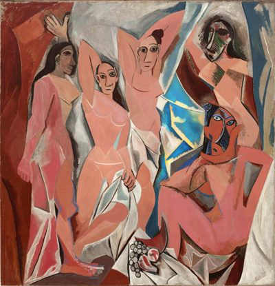
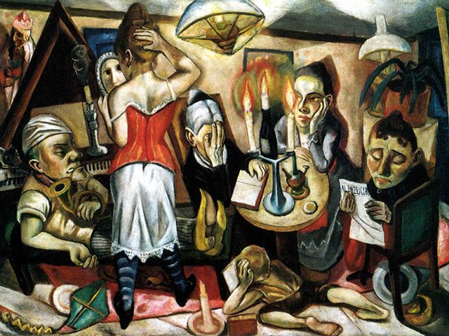
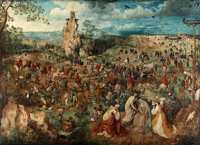
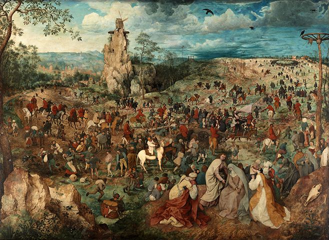
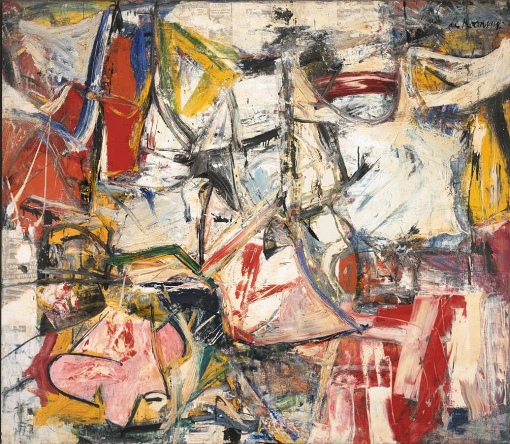
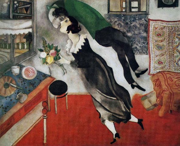
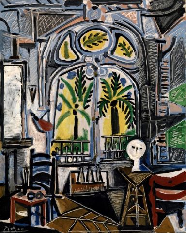
The described mechanism underlines the construction of works as diverse as Brueghel’s Procession to Calvary and Picasso’s Les Demoiselles d’Avignon. It can be written down in a logical form with a conclusion possible to state in a form of an algorithm. Its assumptions are empirically verifiable.
A painting is a closed set of distinct elements, where elements are relatively homogenous fields, thus distinguishable from their immediate surroundings.
The number of distinct elements which can contribute to a composition is unlimited.
The only type of classification common to all elements is the level of dissimilarity between them.
The only type of transformation applicable to all elements, is a change in the relation of similarity between them.
A state of complete harmony exists, such that any perceptible change leads to a lower evaluation of the aesthetic expression of the whole.
A transformation impacting the similarity relations between all elements of a composition should have only one direction: towards increasing the dissimilarity between elements; the opposite direction leads, in extreme cases, to a completely uniform surface of a painting.
The process of increasing dissimilarity between elements can have no end, thus it is necessary to have a top level for this process.
The top level of dissimilarity for the whole is determined by the artist. (For example, one can create a composition using a limited palette, or determine its visual character in some other way.)
All elements must be contrasted with all other elements to the same degree, so no area disturbs the equilibrium of the whole with a local contrast.
At the same time, the contrasts between elements must be set at the maximum level, as only then will they maximally emphasise each other’s features. This maximum is determined by the top level of diversity assumed for the whole painting. It is established following the requirement to maximally contrast each element with the sum of the rest. (This sum is always the reference point for every new element introduced. Thus, should a new element contrast with it too much or too little, the artist has two options: adjust this contrast to match those within the sum of existing elements, or adjust the contrasts within the sum of existing elements to match the new element.)
As any element can only be judged against its surroundings, i.e. against the entire painting, a completely harmonious painting is one where the level of dissimilarity between any element and the sum of all other elements, is set at maximum and thus at the same level.
Let us then designate as Sn any closed set of elements of any size, and every element of this set as e. Thus Sn: = {e1, … en}. Further, let us designate the ratio of contrasts between elements as C. We can now write as follows:
∀ei ∈ Sn C(ei, Sn\ei) = Cmax (Sn)
For any element belonging to a finite set of any number of elements, the contrast (degree of difference in appearance) between this element and the sum of the remaining elements of this set is equal to the maximum contrast value for this set.
One could ask: how can we measure the level of contrast between elements? Computer image analysis systems are developing rapidly, but creating a complete and precise inventory for a structure as complex as all of painting, is not yet fully possible. Human visual system perceives images altogether differently. Unlike computers, we see the entire image instantly. Contrasts and differences draw our attention intuitively. We thus don’t need to measure anything.
Understanding compositions requires introducing changes to images. Such changes are made very precisely, retaining the structure and style of the original, of course. Next, both versions – the original and the modification – are presented to the participants in an experiment for their assessment. The study results are quantitative, but with appropriately introduced compositional changes, they are clear enough to reveal what leads to increasing the level of harmony, or to its destruction. Obviously, not everyone has the same visual sensitivity and not everyone is capable of evaluating art or indeed its compositional aspect itself. It is not necessary to be an art critic or painting expert to perceive harmony. As it turns out, enough people who need not be professionally engaged with art are capable of greater visual sensitivity, or the ability to perceive relations between forms. This capacity need not be correlated with the ability to definitively distinguish between great and mediocre works. Neither need it be related to artistic education. What we are evaluating are not different original paintings. We are investigating the impact of one original painting and one or more modified versions of the same painting. Appropriate visual sensitivity can be determined through eye tracking experiments – it is exhibited through differences in eye movements while subjects are looking at a painting. More on this topic can be found in the following paper: Eye Movement Correlates of Expertise in Visual Arts.
A further issue concerns the abovementioned introduction of changes to original paintings. Who makes those changes, and on what basis? How does this person know which paintings are composed so harmoniously that any perceptible change will compromise their aesthetic value? The answer seems simple: somebody who can simply see this and has sufficient amount of experience in painting to be able to introduce such changes. But this answer is not sufficient to remove doubts about the trustworthiness of such experiments. These doubts creep in when one fails to carefully examine the concept of the study. Importantly, we assume that the number of participants in the study who exhibit high visual sensitivity will yield a statistically significant result which satisfies the criteria of the existing standards. The issue of introducing changes to paintings remains. I will try to address it through a thought experiment. Imagine we have a good copy of a painting, any painting. We find a technician competent in graphics editing and photo retouching, sit him in front of a computer and ask to make a change which in his opinion improves the painting. If the composition of the painting was not perfectly harmonious, changes can yield three effects: the modified painting will seem more attractive than the original, comparably attractive as the original, or less attractive than the original. The first and second result imply that the composition of the studied painting was not fully harmonious. The chance the exercise will yield one of those two results increases if we replace the technician with a painter who has an exceptional ability to detect relations between forms. Introducing a further restriction which requires that only the first result (where the modified painting is judged better than the original) is taken to have implications on the evaluation of a painting’s harmony, should dispel any lingering worries regarding the results of the experiment.
In a case of a fully harmoniously composed painting, the original should win with any modified versions. Should qualifying such a painting in this way fail to address all of one’s worries, one can run the experiment oneself. The comparison of the results and methods of different studies can increase our knowledge of harmony and the perception of beauty in art.
Let me expand on the topic of modifications. Changing an existing composition assumes that the change will be possibly minimal, just enough to produce an effect measurable in a quantitative study. It is obvious that this excludes holistic modifications such as changing the saturation of all colours or the contrast on the entire surface of the painting. It is, however, possible to add or remove elements, introducing local changes in colour or contrast, shape modifications, moving objects – anything that will leave enough of the painting untouched to ensure that the participants won’t simply think that the modified version is a different painting, or the same painting but recreated in a different style or technique. Doing so ensures that we control for participant preferences regarding artistic styles and conventions, and focus on the quality of the composition only.
After reading about harmony described in this way and studied in such detail, one might think that none of the less than fully harmoniously composed paintings should ever impress a sensitive audience. However, this is not so. One’s right to being impressed cannot be limited in any way. We merely want to draw the attention of those interested in art that harmony of that level existed and artists of such extraordinary ability deserve special attention – especially since there were relatively few of them.
Another issue which deserves a mention is that paintings can harmonious to a varying degree. One often reads descriptions and analyses of artworks where the authors speak of complete balance and harmony. Meanwhile, there is a great number of technically perfectly executed paintings where the artist crossed no threshold, nothing stands out too much in any way, and certainly nothing particularly bothers us. Yet they cannot be said to be fully harmonious. This is because while equilibrium is retained between large groups of forms, within those groups elements are not maximally contrasted with one another, and thus introducing sometimes surprisingly substantial changes does not make one feel that the expressive value of the whole has been compromised.
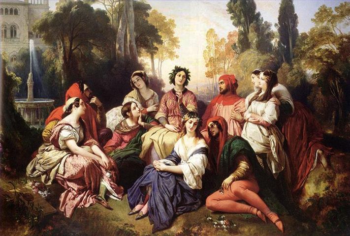
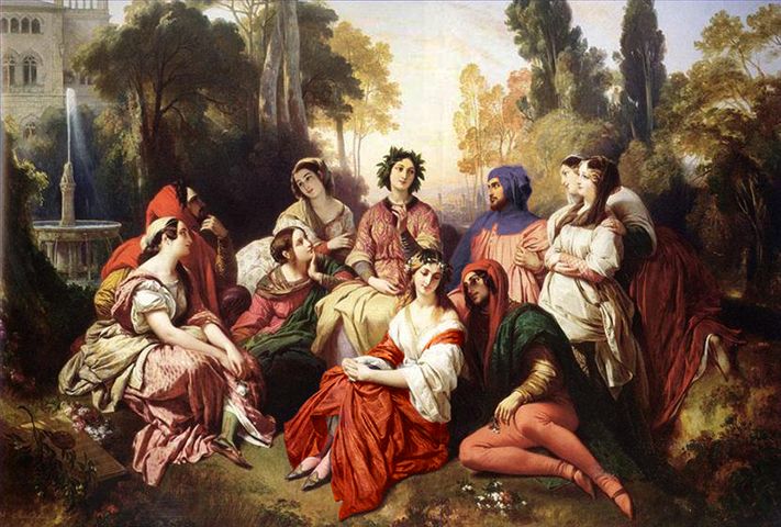
Consider for example „Florinda” by Franz Xaver Winterhalter.
As it turns out, a mirror transformation of the entire lower part of the painting (B) does not make viewers think the modified version is worse.
The opposite is true in the case of the following pair of paintings:
A rather small change in the top left corner in painting (B) makes it significantly less attractive to the viewers.
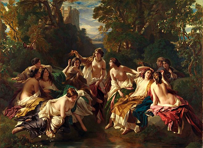
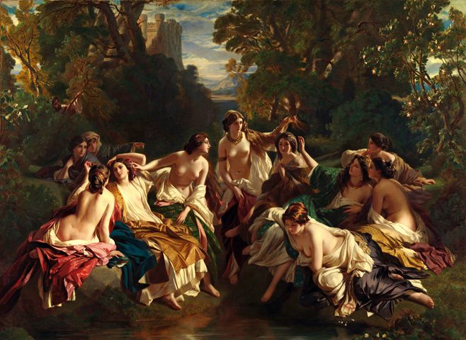
The aim of inquiring into the harmony levels in different paintings is not to discredit those less harmonious. It is instead to draw our attention to what harmony is to art. Should we disturb the contrast between the bright group of women and the dark background of the forest in the first example, perhaps by lightening up parts of the forest with sun rays, we wouldn’t destroy the painting’s pastoral feel and the quality of the technique would stay the same. Yet we would introduce a bit of chaos which could likely be further expanded in the same way.
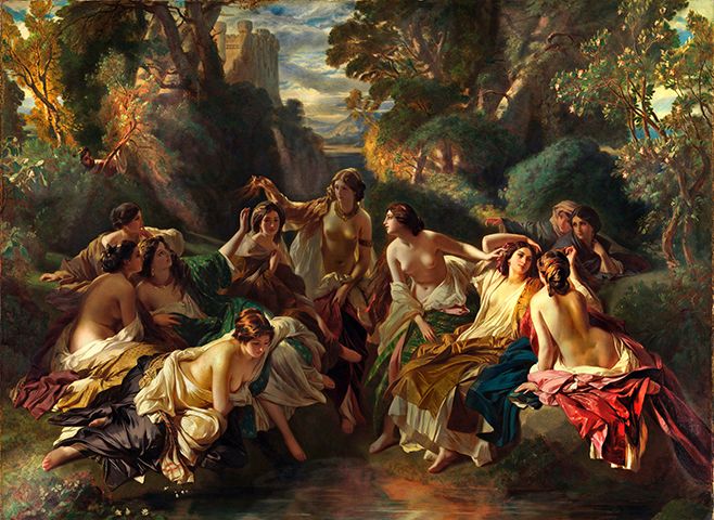
Let’s compare the original (A) with version (C). This demonstrates quite clearly that harmony is a matter of degree, and makes one realise what really makes paintings beautiful – composition, which only has two directions: chaos or harmony.
As I describe the rule of dynamic equilibrium, I feel I need to mention a number of related issues in composition which are at least partially discussed in composition classes.
This will be a kind of correction based on practical experience. To create a well-composed painting, apart from taking care of the dynamic equilibrium, one should create what I will call a compositional axis. One has to give the audience a feeling of appropriate framing. In simpler terms, something needs to take the centre stage. This is done by noticeably but naturally not overwhelmingly increasing the contrast, or the dissimilarity level of a selected area located roughly in the field determined by the golden ratio. All size proportions of this area and the intensity of those differences depend each time on the entire arrangement of elements. They further depend on another interesting phenomenon: the variations within the painting’s surface with respect to their perceived importance. It turns out that forms located in the central part of a painting are perceived as more important, or perhaps we are more sensitive to them than to those located closer to the edges. This is likely because the sharp and straight edge cuts through the nearby forms, creating a new contrast the strength of which weakens the contrasts between the forms themselves. To retain dynamic equilibrium, contrast between elements located there needs to be somewhat lower than between those at the edges. Otherwise, they will become overly dominant and divert our attention from the rest of the painting. This might seem to contradict what I wrote before about creating the compositional axis through placing it roughly in the abovementioned field of somewhat increased contrast. But this is no contradiction – painters who have a good eye for composition can bring both those requirements together, ensuring that the contrast between the elements they place in this field of increased sensitivity, as we will call it, is such that the forces of those opposing tendencies remain in equilibrium. What should be the ratio between the forces of those two tendencies I cannot tell, despite being involved in this for over forty years. The painting’s layout has a profound impact on composition. Achieving harmony is somewhat easier in squares than in rectangles, especially those more elongated. In vertical paintings the field of increased sensitivity does not fall on the vertical centre, but seems to be asymmetrically placed slightly above it. This can be tested by turning the canvas upside down – sometimes the contrasts which were balanced in the normal orientation become reversed. In other words, as the painting is turned upside down, an element placed below the centre enters into the field of increased sensitivity and becomes stronger. It is very instructive to consider the above thoughts while composing works on non-rectangular surfaces. Should one cut a semicircle hole in a cardboard surface and hover it over fragments of various paintings or designs, one will notice that through it pretty much anything looks decent. The details of equilibrium vanish and the laws of harmony discussed here seem to lose their power. This happens because the semicircle shape itself is so potent and expressive a form that introducing it makes the play of contrasts within the composition fade. This certainly makes the lives of fan designers easier. Circles and ellipses, with their symmetric character, are less aggressive than a semicircle and creating compositions within such formats becomes once again a challenge.
If you are interested in finding out if you are sensitive to composition, select the harmoniously composed rectangle below. All rectangles are composed of nine identical elements.


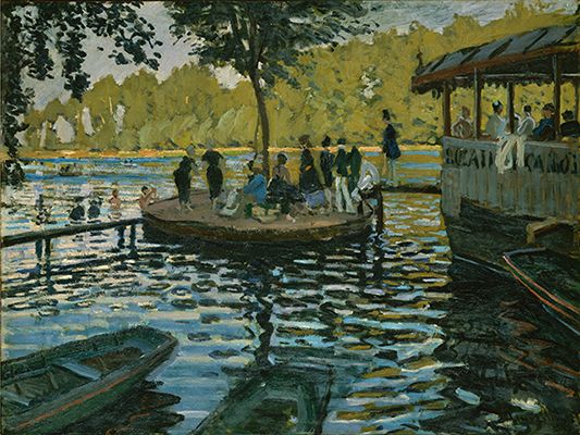
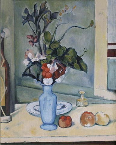
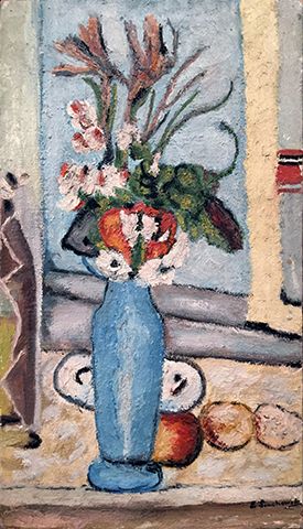
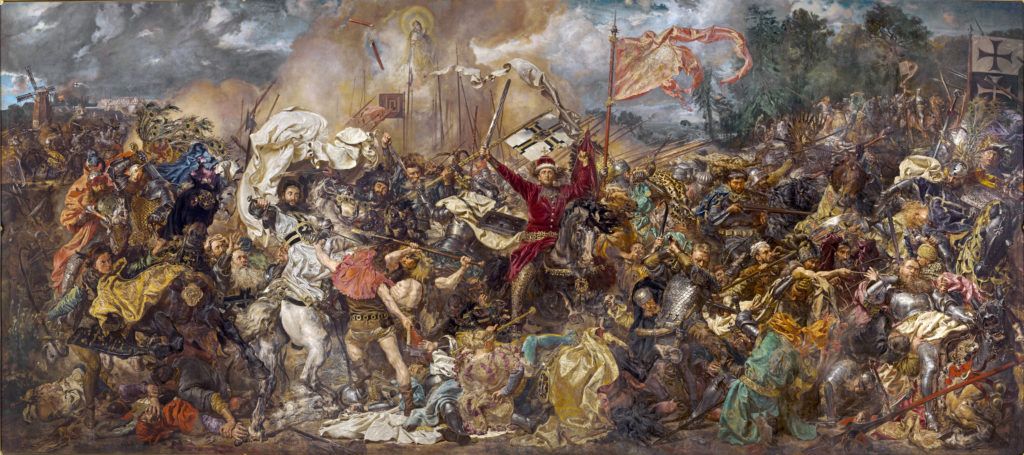
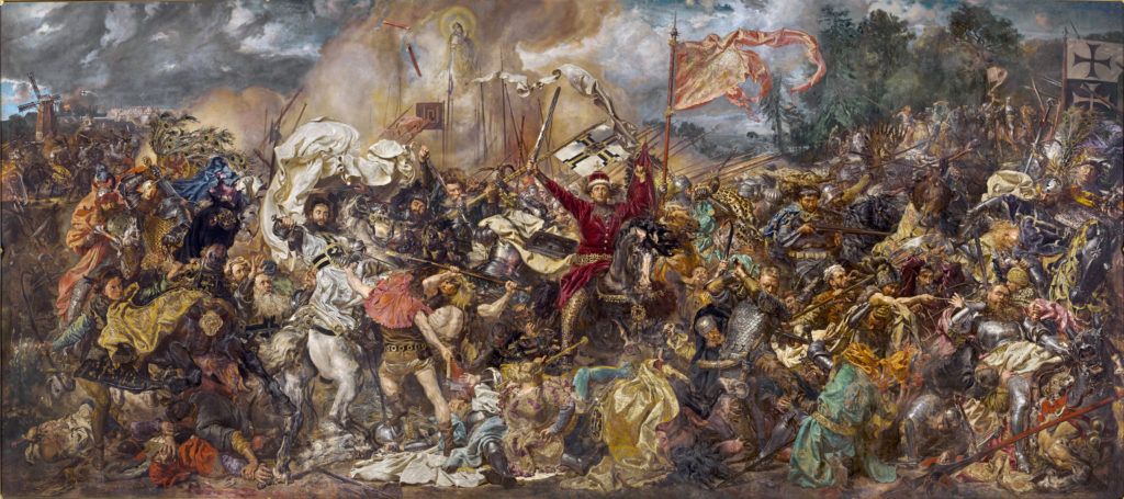
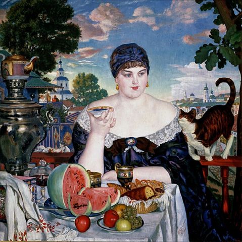
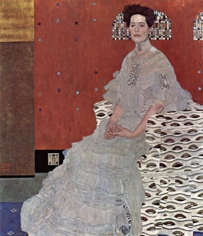
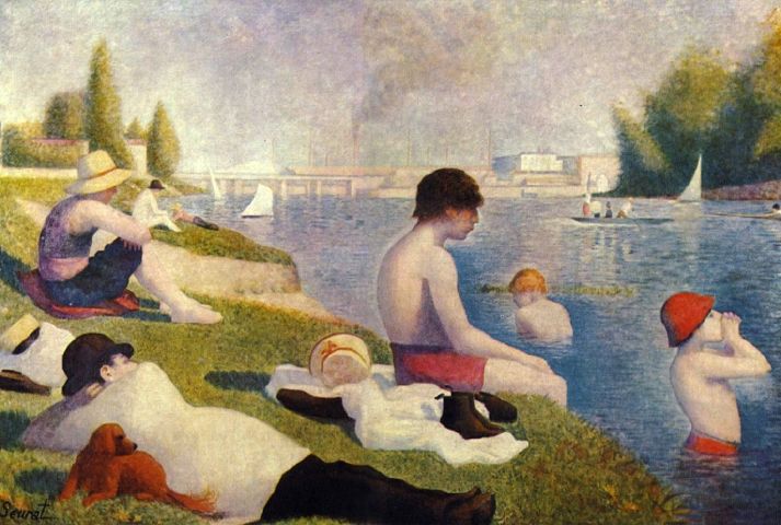
We rarely see the same view painted by two different painters but around the same time. One of the following paintings is fully harmonious. It is easy to see what is missing from the other one.

Let’s see what will happen if a harmonious composition is recast in a different style.
Despite the change in style and aspect ratio, the relations between forms are retained, and thus the recast composition is difficult to improve on.
It is often enough to introduce minor changes in harmonious paintings to help viewers realise how precise a structure they are dealing with.


In the modified version a branch from the top left corner was moved to the right. It revealed a bright patch of sky which draws too much attention, and it’s appearance on the right side reduced the diversity of elements and reduced the overall attractiveness.
Picasso’s „Les Demoiselles d’Avignon” offer another example of the same phenomena: not reaching or exceeding the threshold of maximum contrast pre-conceived for the entire composition.

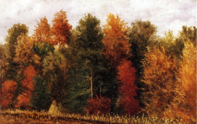
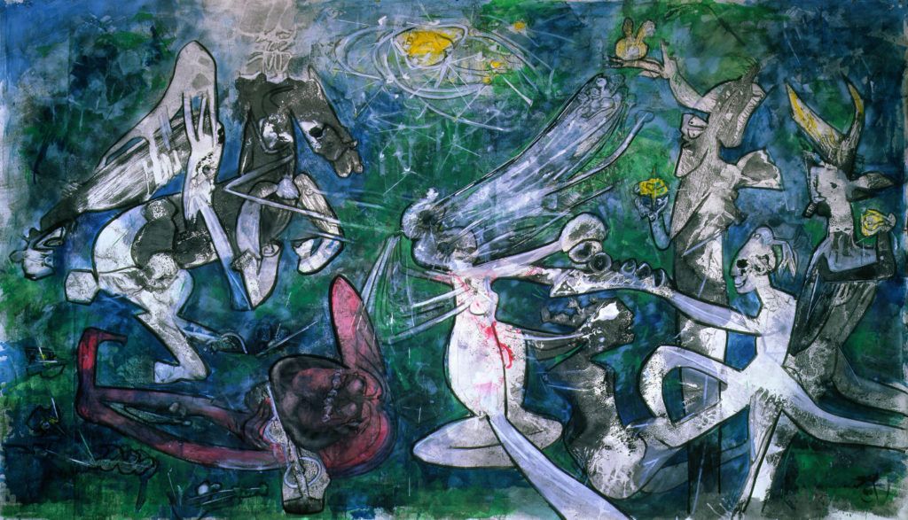
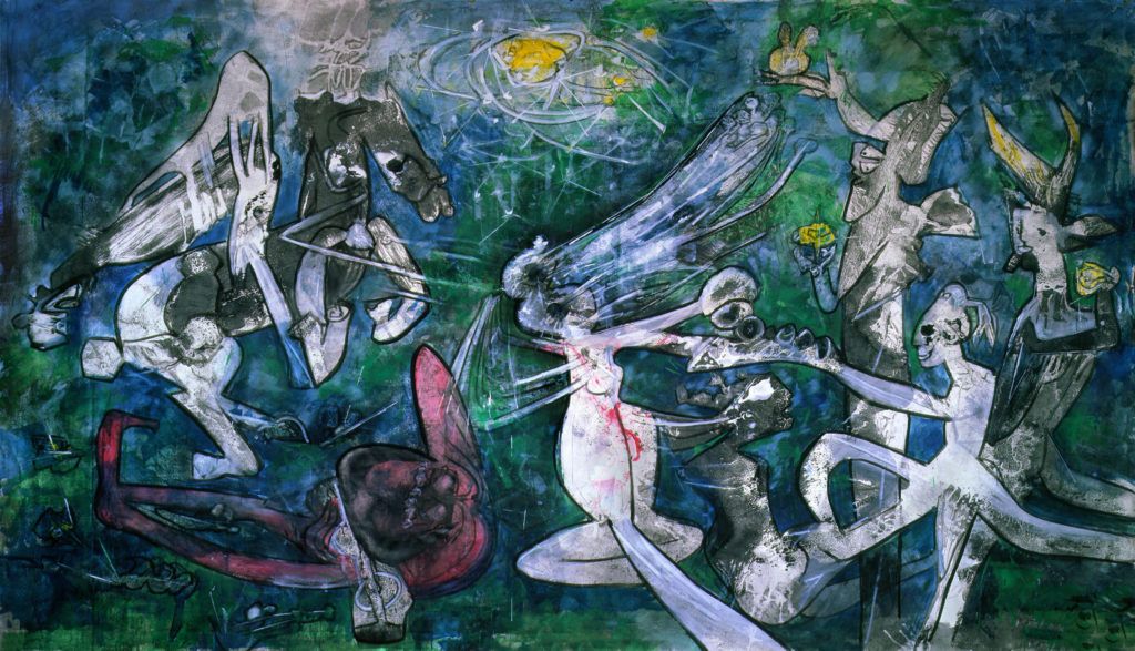
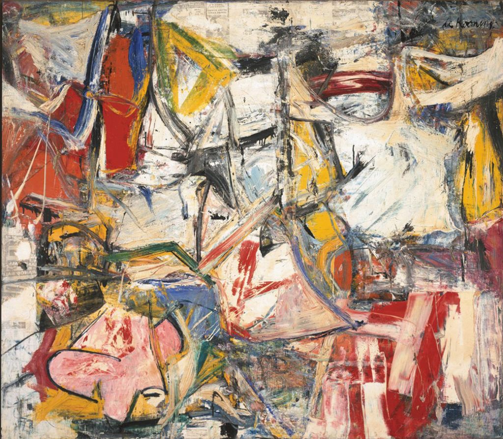
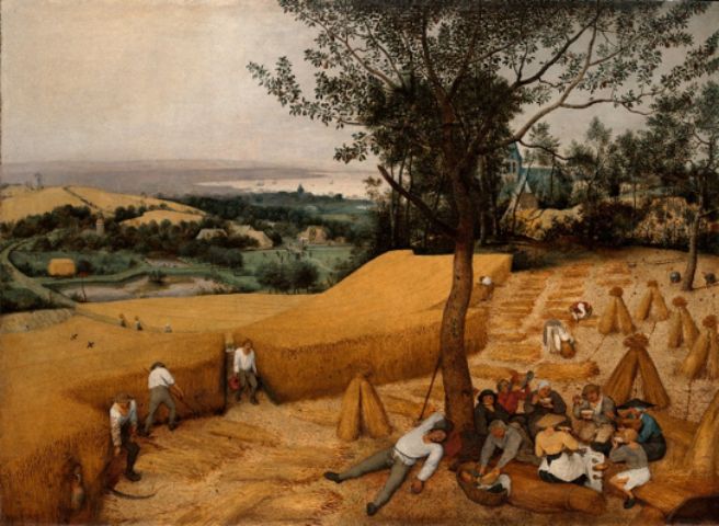
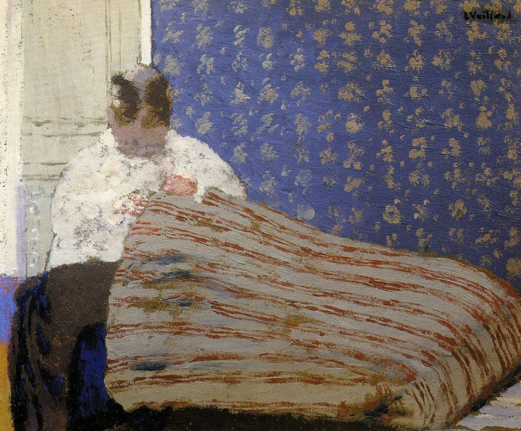
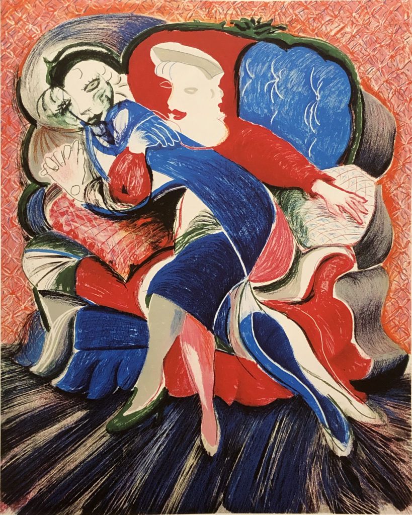
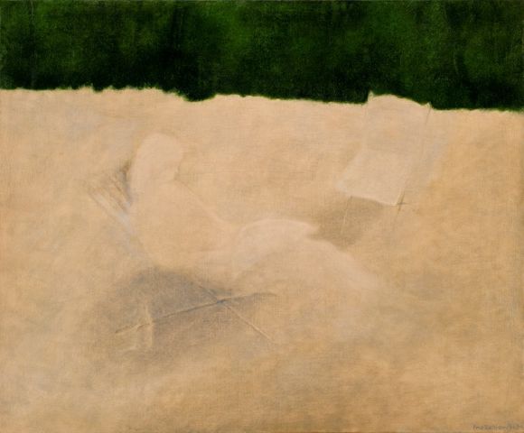
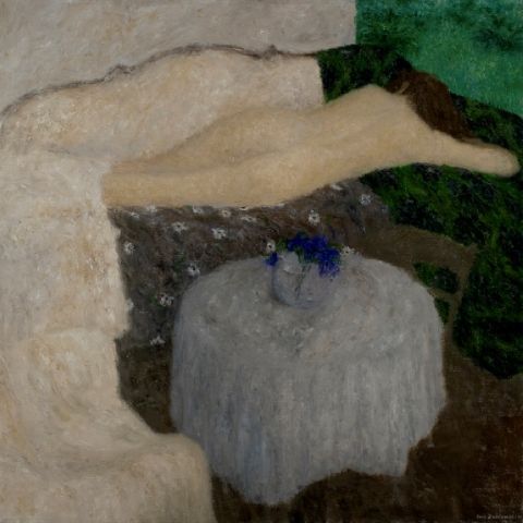
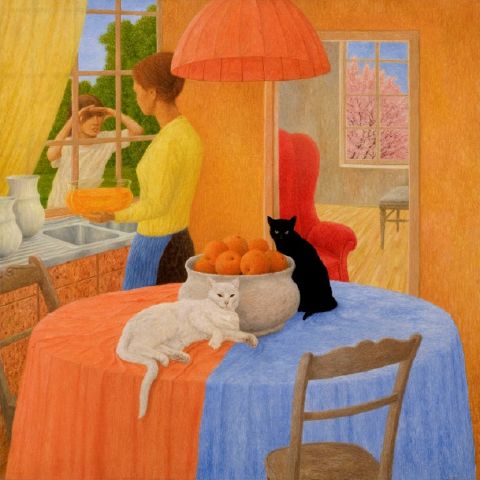
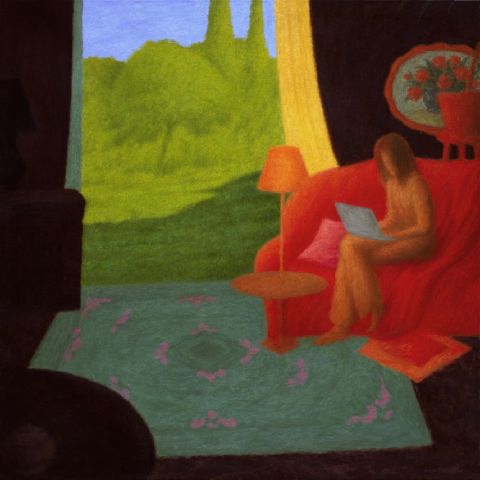
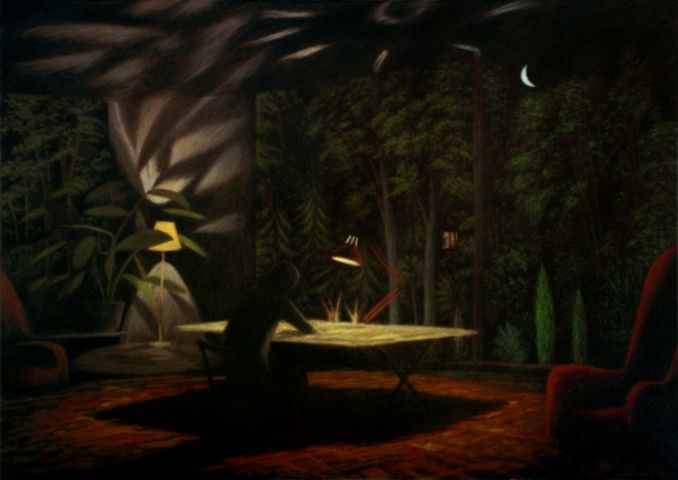
Other examples:
Let us now look at what happens in cases where paintings are not fully harmonious.
In those cases a modification improved the evaluation of the paintings. But lack of harmony is also implied by a lack of change in the evaluation.
Aesthetic evaluation might stay the same even when we introduce changes to almost every part of a painting.
Perhaps you would like to check if it is possible to improve any of the following paintings? Try to find them in high resolution versions, open in a graphics editor, and try!


If your friends will judge your modification to be better than the original, please send it to us. We will get in touch to negotiate a collaboration 🙂
On behalf of COMPOSITION MATTERS
Iwo Zaniewski
Footnotes:
1. Rudolf Arnheim. Art theoretician and psychologist of visual perception.
2. Max Wertheimer. German psychologist and philosopher, one of the creators of Gestalt psychology. Researcher of visual perception.
3. Sir Ernst Gombrich. An outstanding Austrian art historian and expert on culture.