
What do we find prettiest?
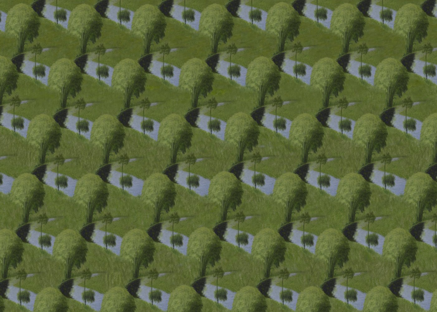
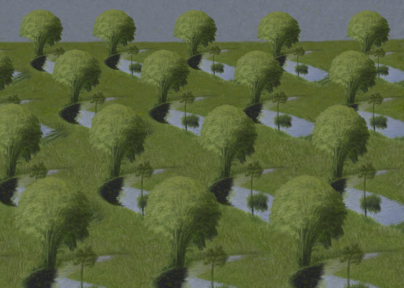
There are many reasons why we might find something visually appealing. One of them seems common to many people. I intend to answer why for most of us, some sights – such as landscapes, cityscapes, building interiors, scenes and everyday objects – are more pleasing than others.
But first, let’s take a look at some images. I’ve arranged them in thematically-related pairs. Let’s treat these images as part of the real world, not artistic creations, even though some of them would undoubtedly fit in the latter category.
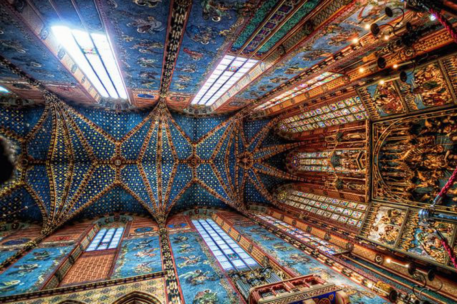
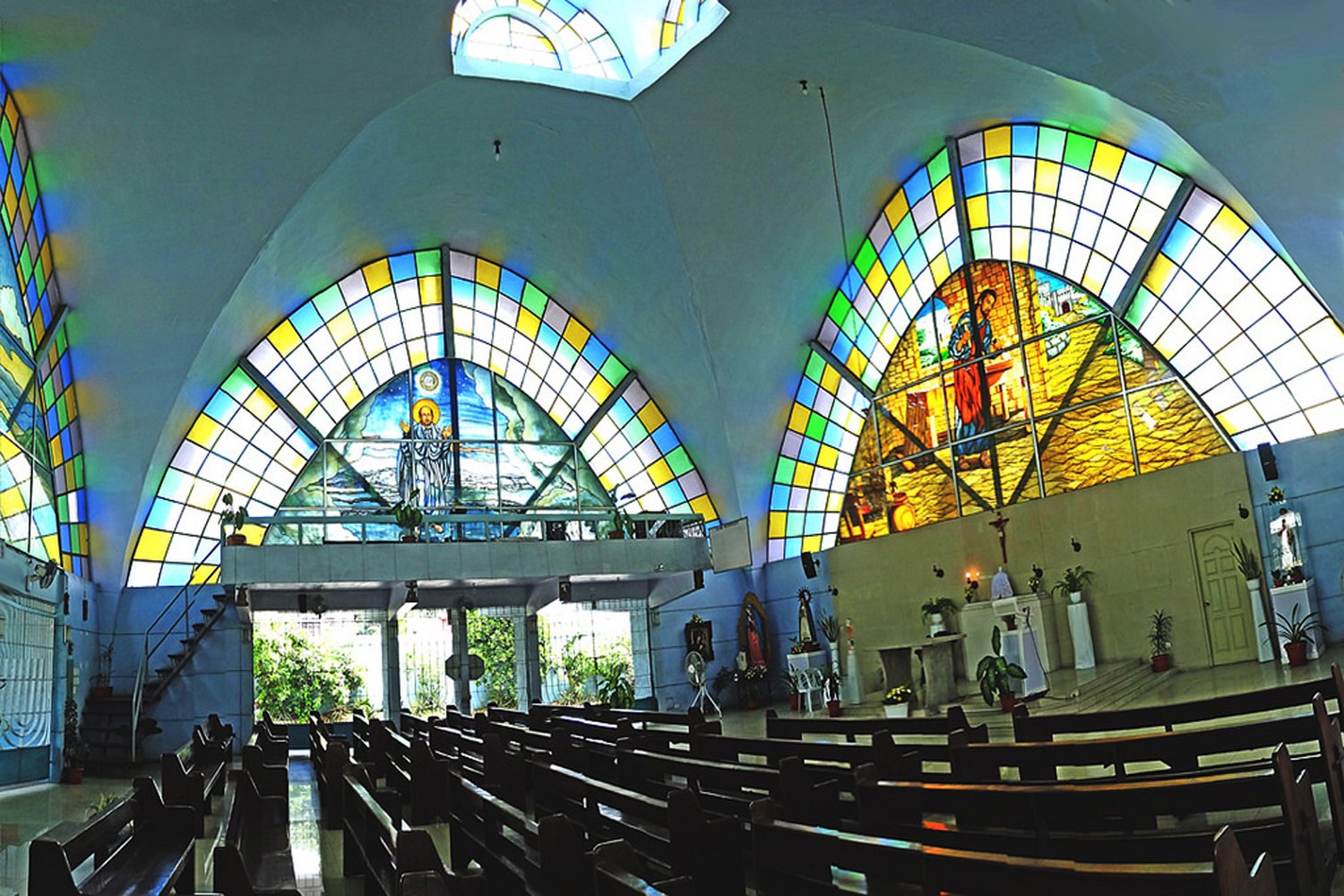
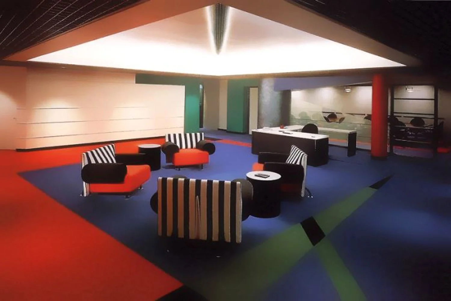
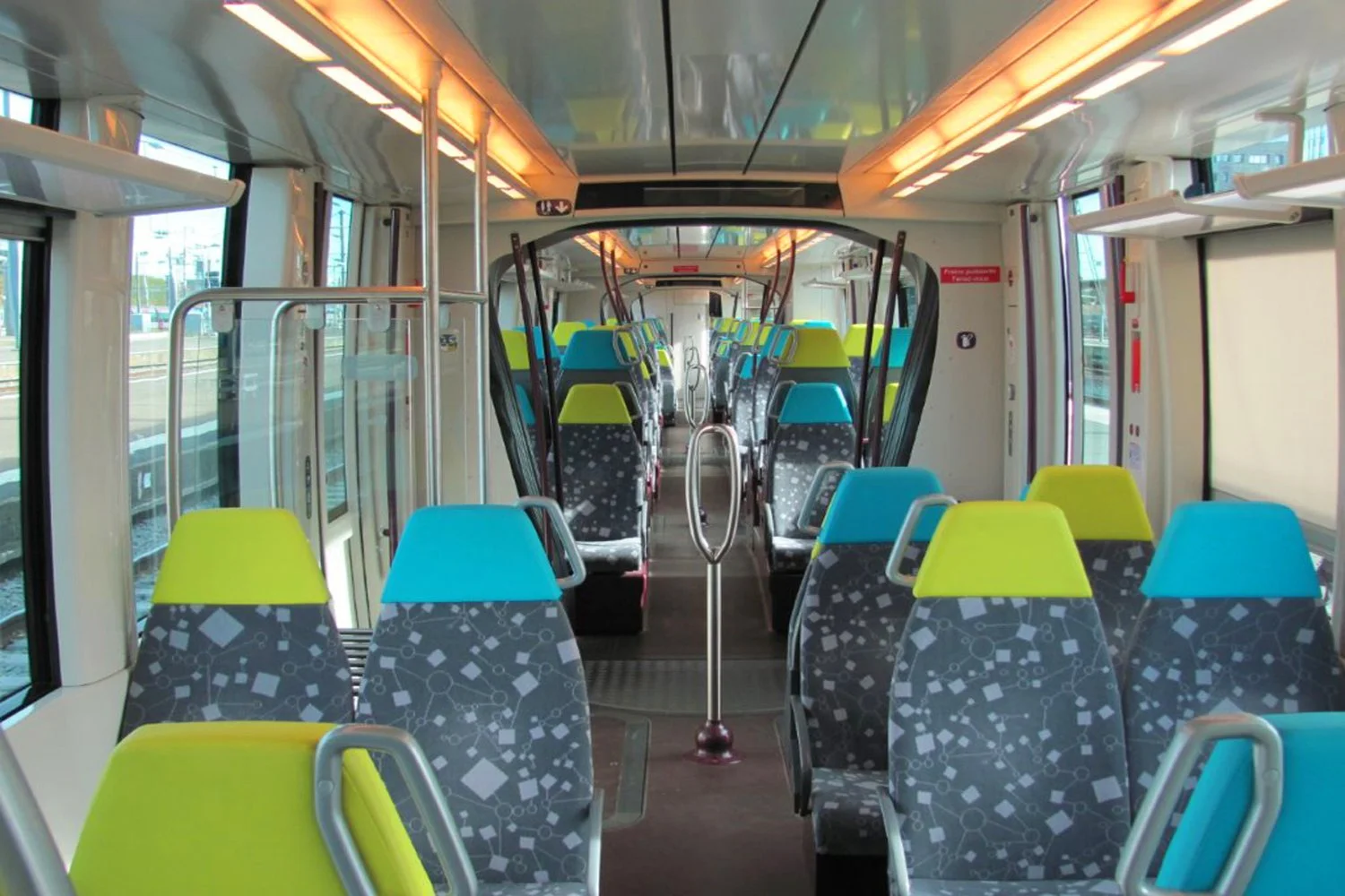
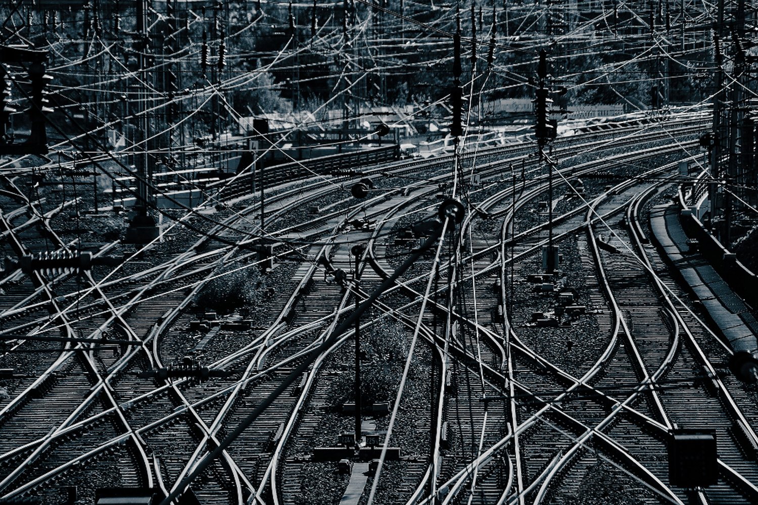
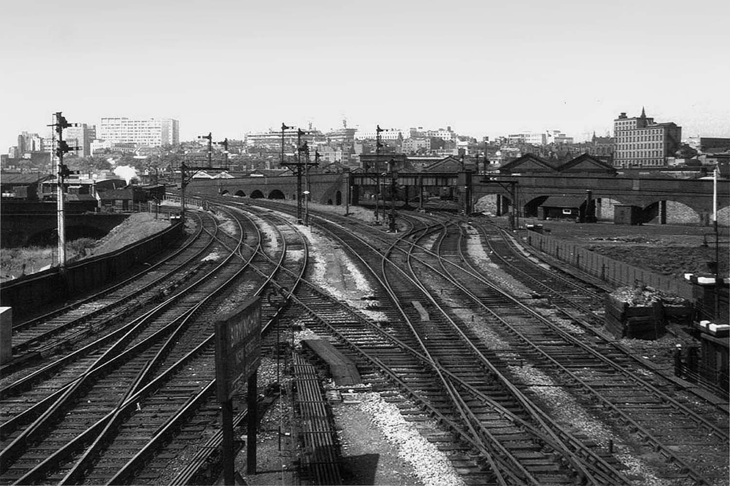
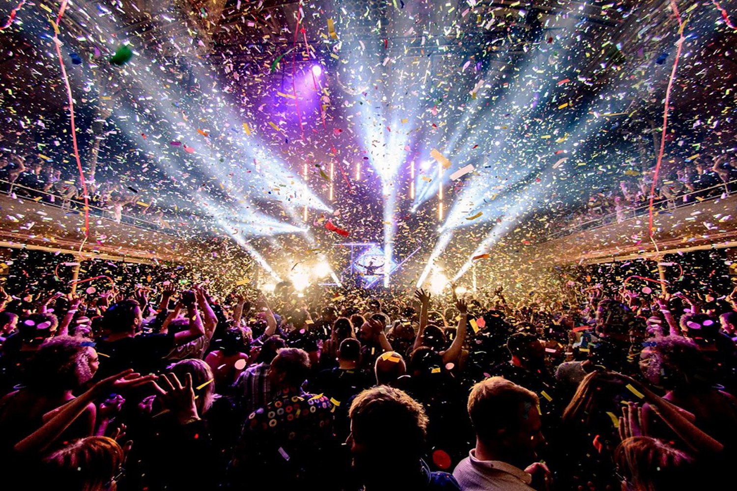
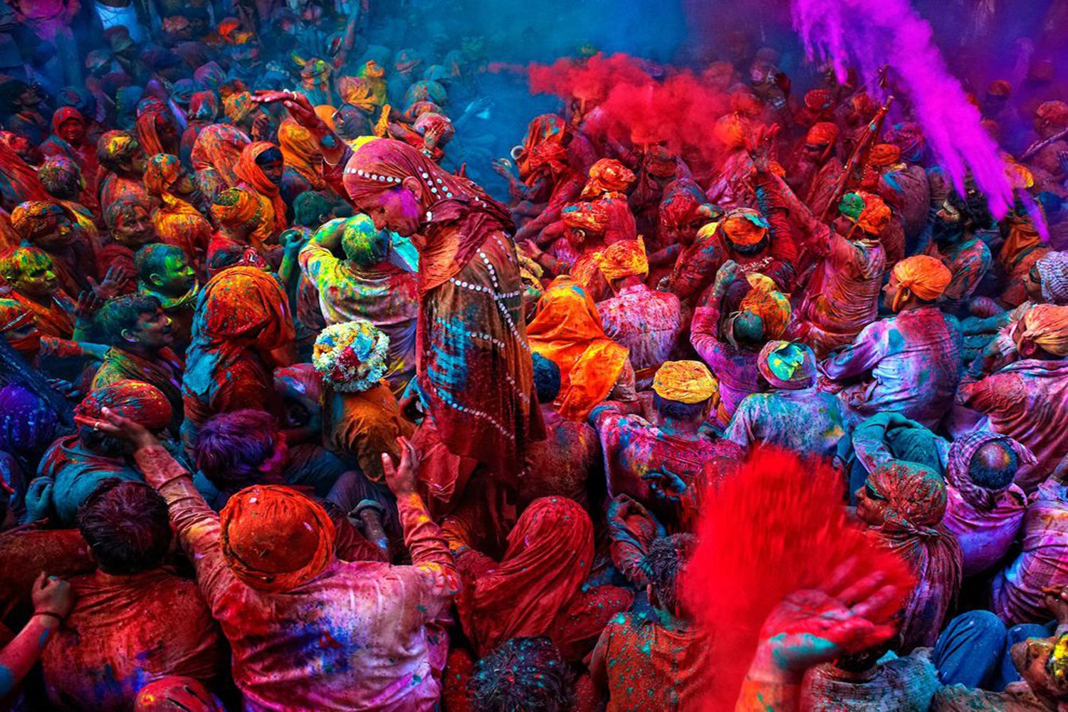
On the left, I’ve placed sights typically perceived as much more pleasing than those on the right.
1.


2.


3.

4.


5.


6.

7.

8.

9.
10.


11.


12.
13.
14.


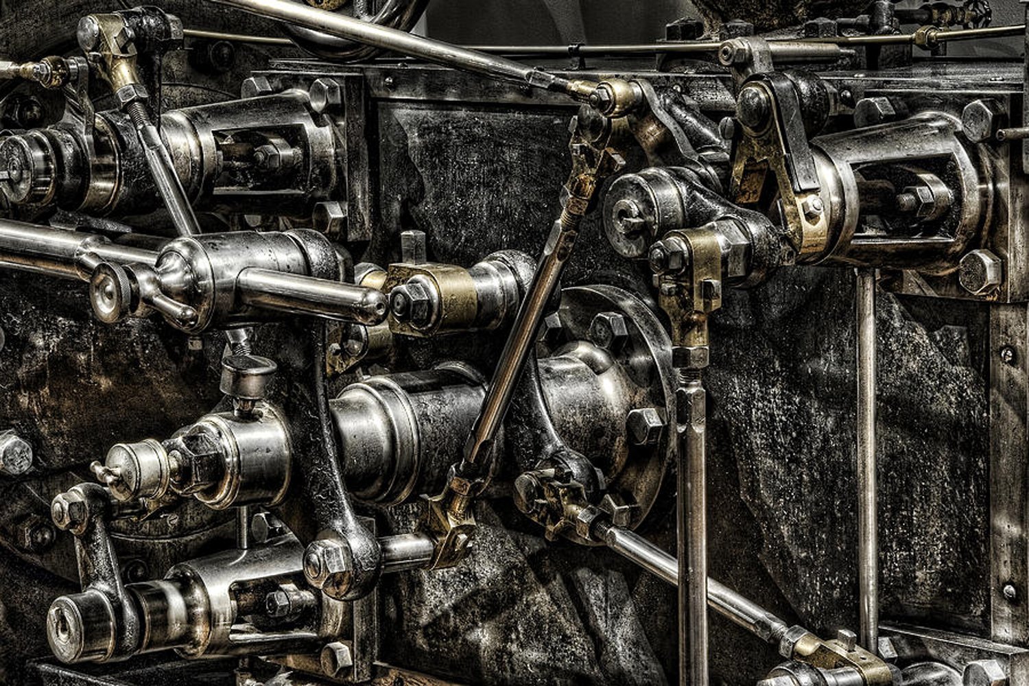
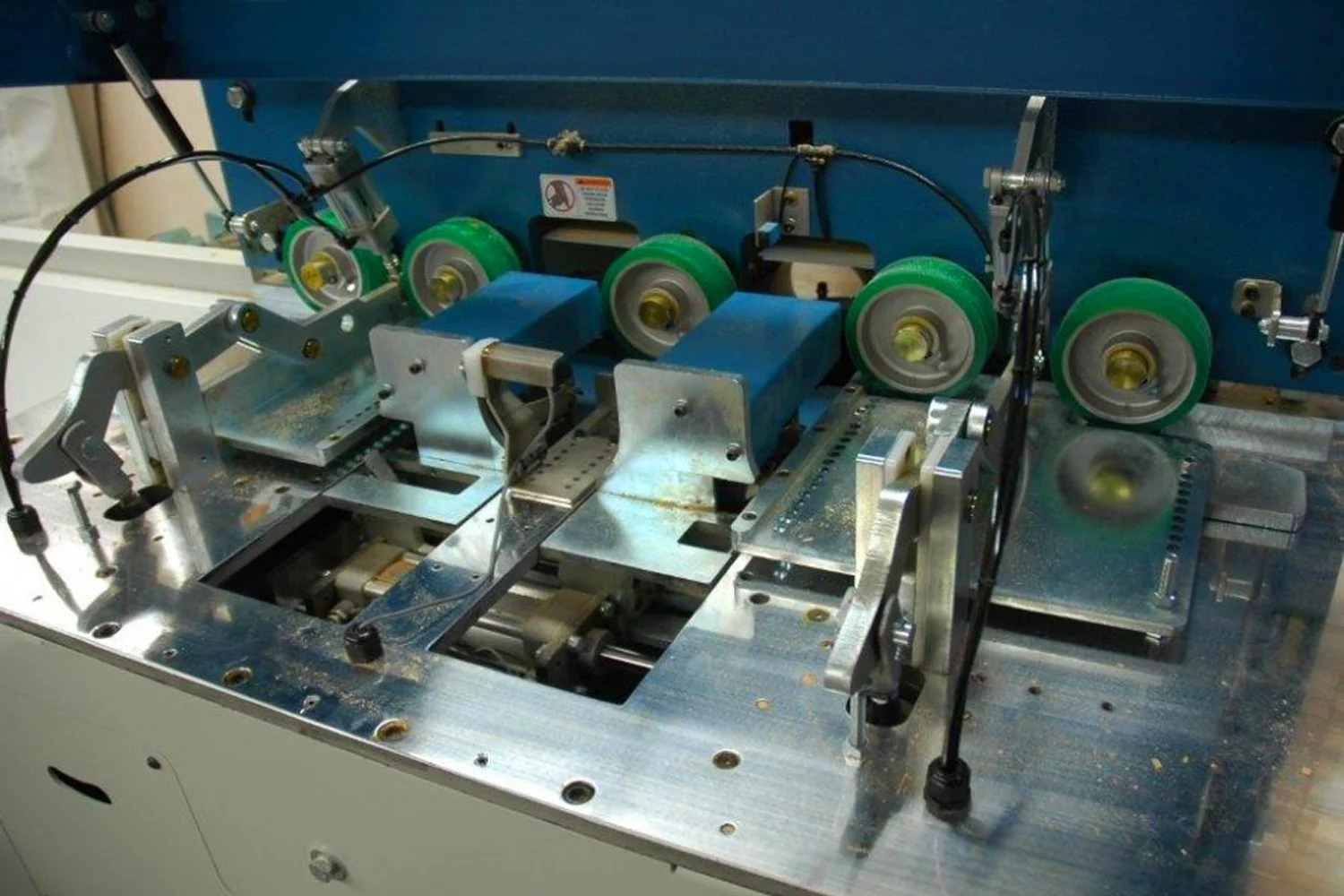
15.

16.


17.


18.

19.

20.

Now let’s consider what the images on the left have in common and, thus, what distinguishes them from those on the right.
Each image consists of many elements, groups of details interlaced in various parts of photographs. Some may appear to highly contrast with each other, while others seem more toned down. In focusing on the compositional aspect alone (rather than our own attitudes towards the depicted places or objects) we can see that the groups of elements which constitute the images on the left are less internally diverse than those on the right. These elements can vary in colour, shape, size or texture. In the images on the left, the degree of contrast is more moderate or, in other words, more evenly distributed than in those on the right.
Take, for example, the image of the Hindu crowd celebrating Holi (image set 16). At first, it might seem more internally diverse than the image of the crowd on the right. Yet on closer inspection, it appears to be composed of elements that are much more alike. The image of the crowd on the right consists of a wide variety of elements; the colour and light contrast is higher in some parts and lower in others. Cut through by diagonal elements, the image is divided in two, with the top half dominated by a square screen. Instead of enhancing the expressive power of the adjacent parts, these contrasts weaken it through their randomness. Such irregular distribution eventually leads to chaos. A similar effect can be observed in the pictures of the nightclub (image set 14).
Part of the appeal of the old English jack plane lies in its resemblance to a wizard-like tool (image set 18). Equally, its multiple metal bolts and handles differ in such a way that no single element draws our attention away from the others by excessively standing out. Yet this is precisely what happens with the jack plane in the other image.
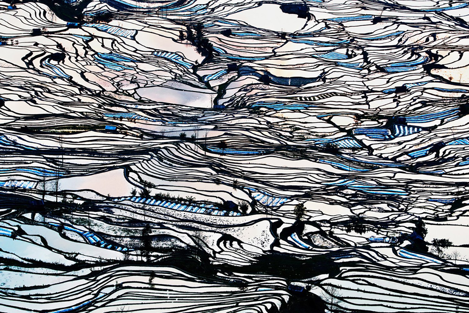
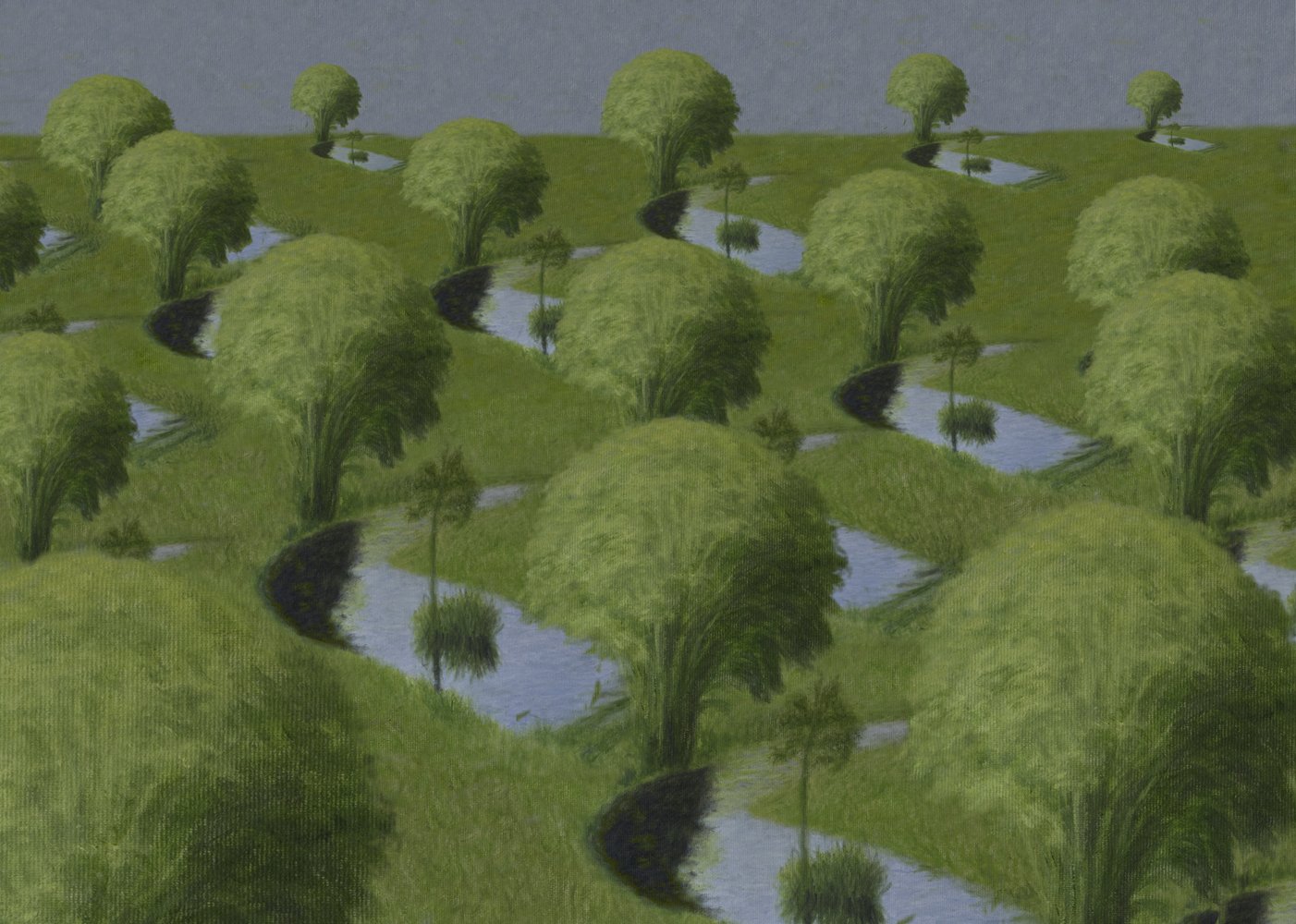
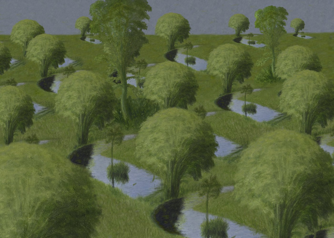
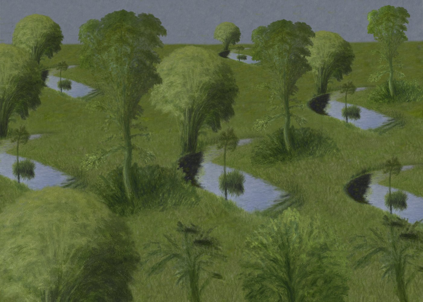
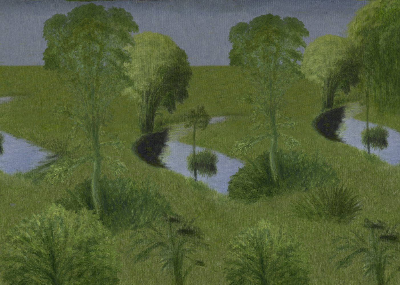
The photos of rice fields are perhaps best at illustrating this phenomenon (image set 1). While looking at them, we might ask ourselves whether the sight would be even more pleasing if all the rice terraces became even more homogenous.
Let’s imagine the structure of the fields resembling something like this:

If the elements became even more similar to each other, we would reach this:

At which point, then, does the degree of internal diversity of compositional elements turn a monotonous image into a compelling one which is more pleasing to the eye?
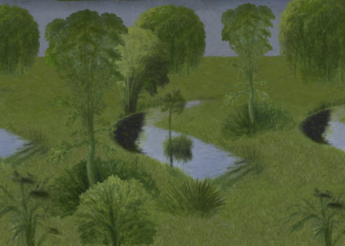
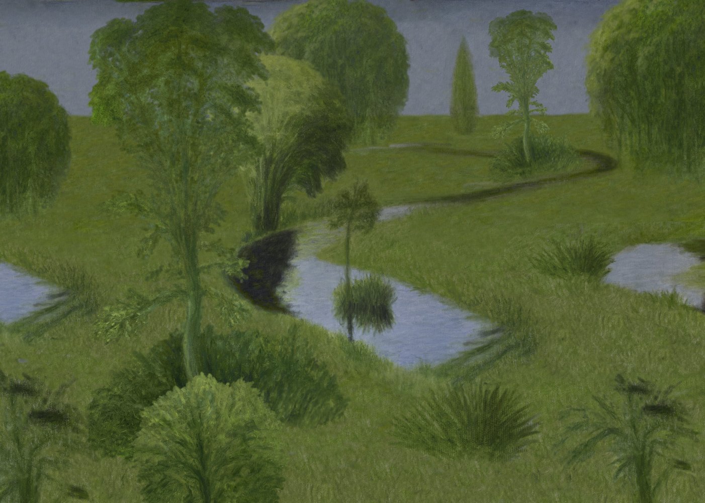
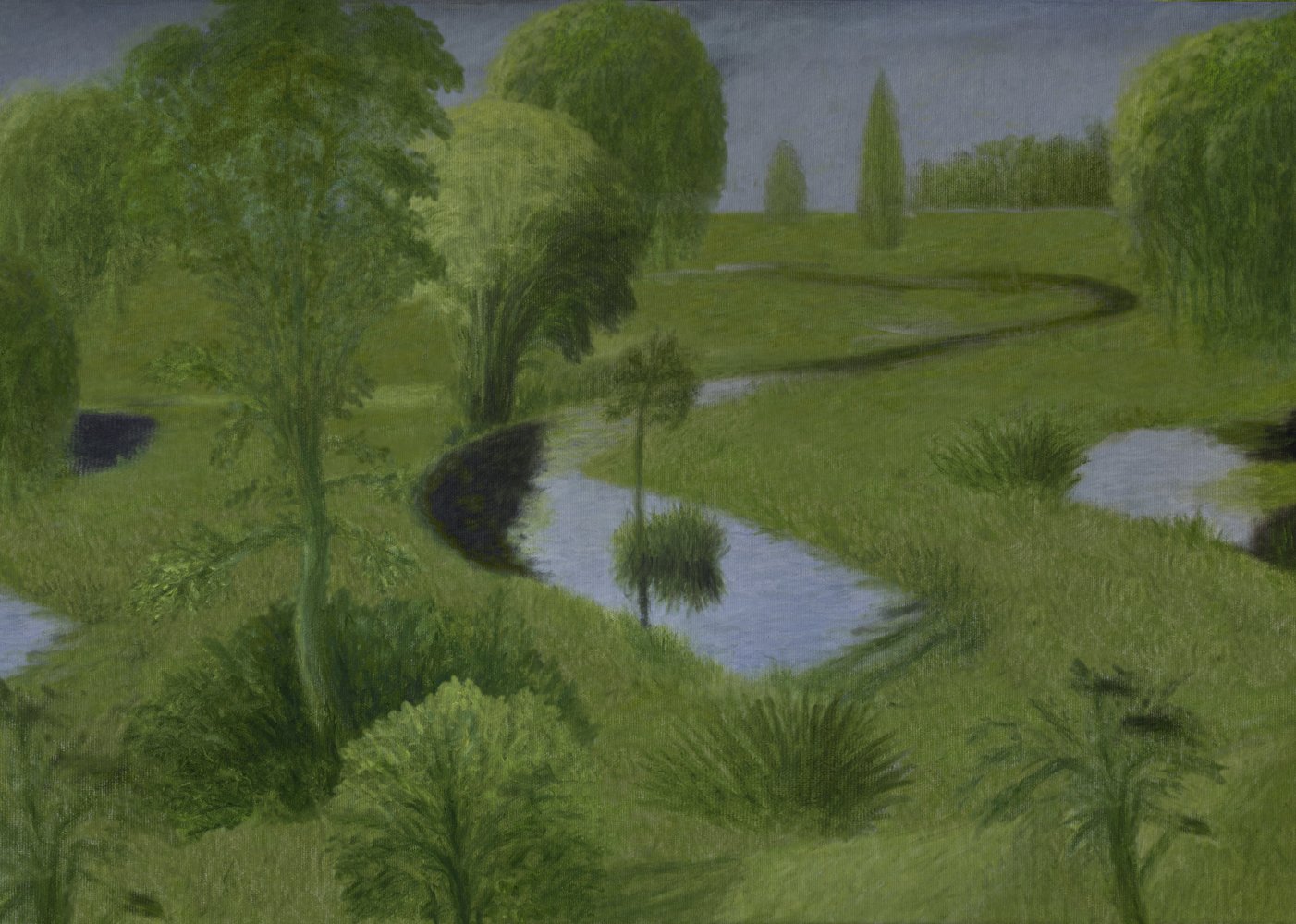
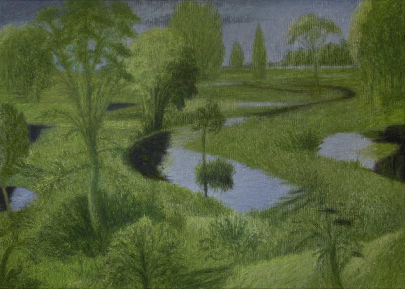
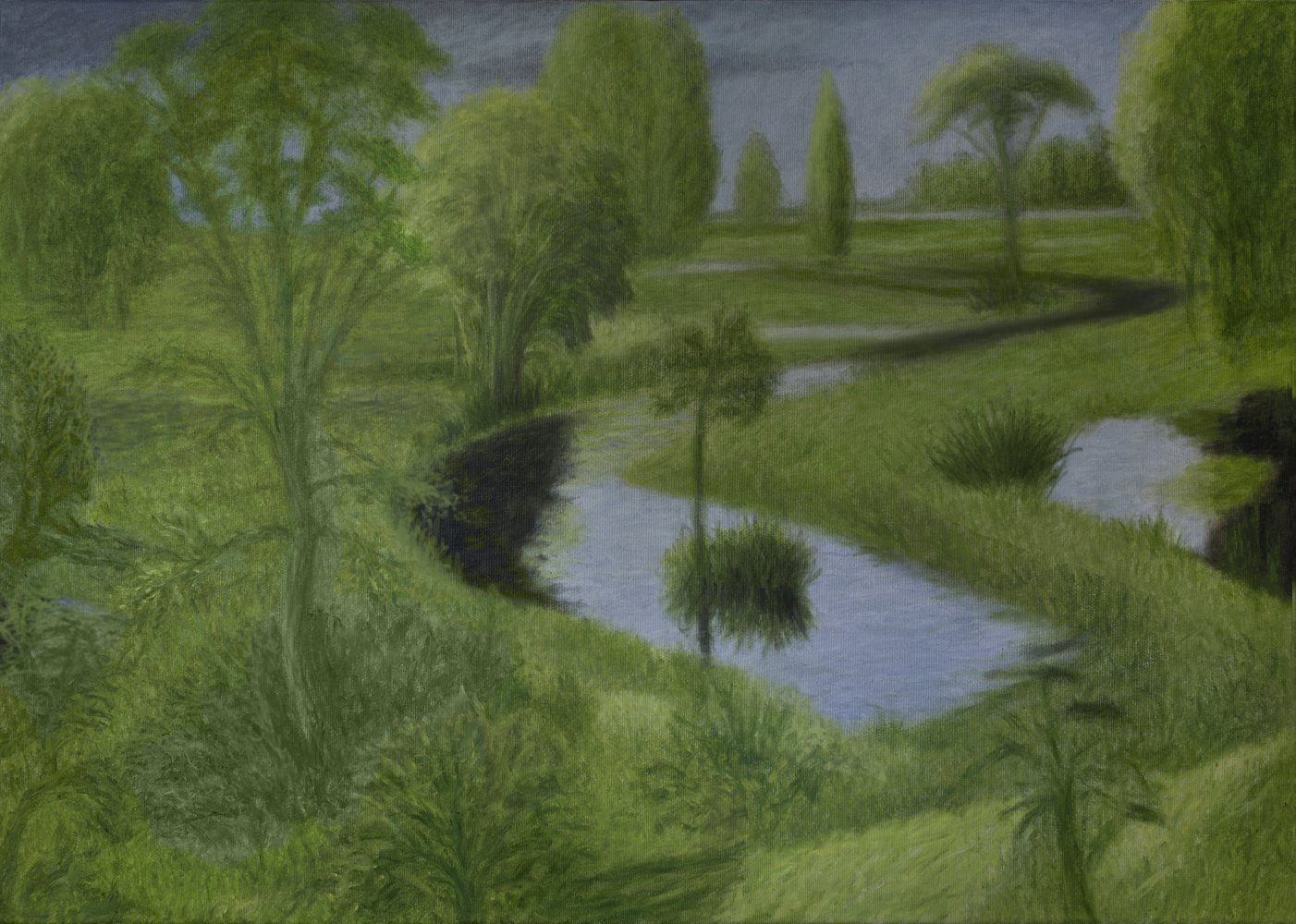
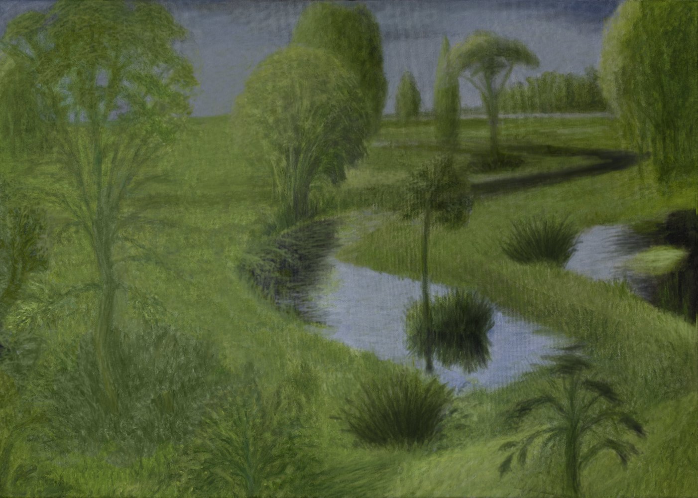
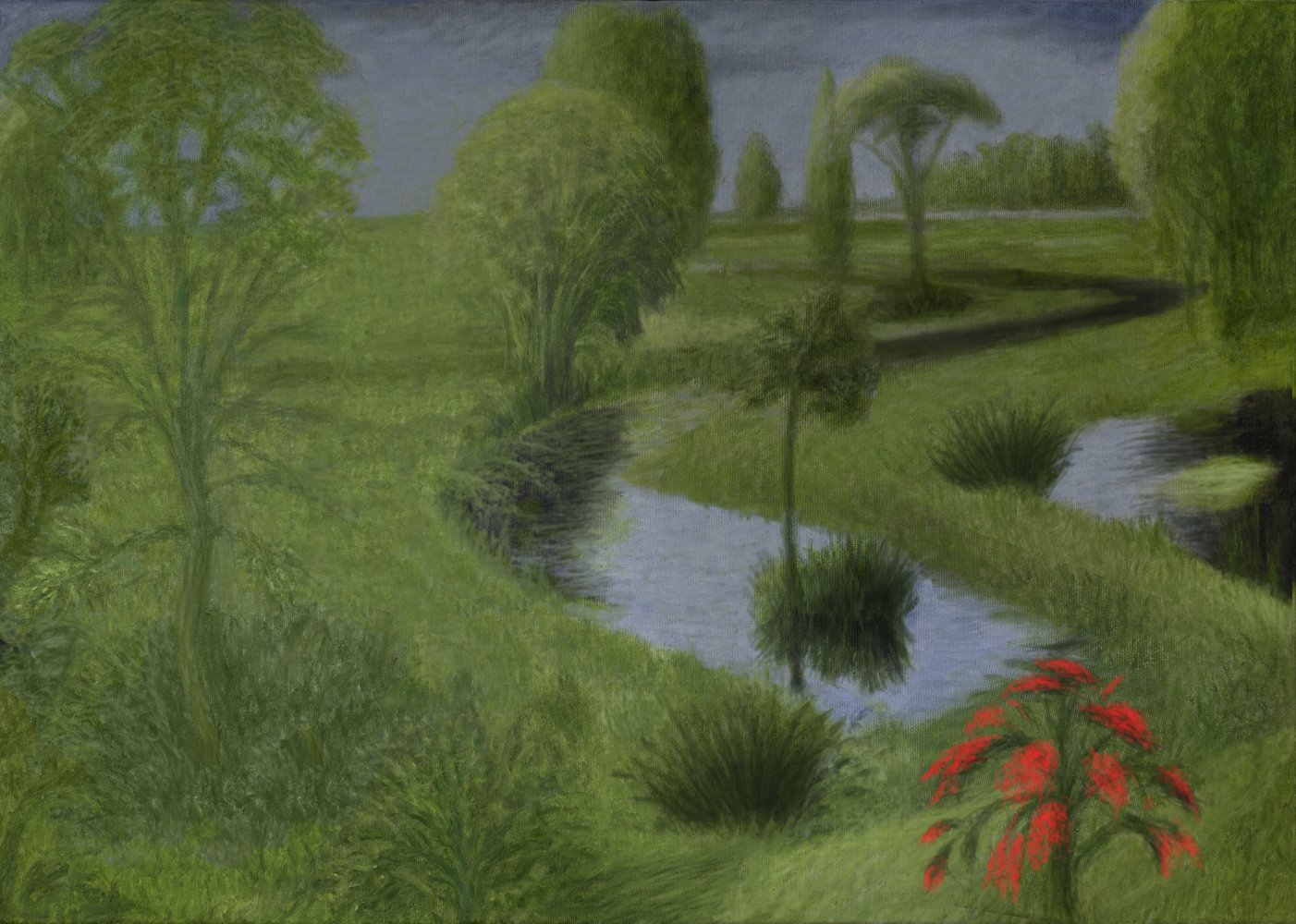
Please use the arrows to click through and view the following 14 images of a changing landscape. While doing so, consider which image is most pleasing to you:
1

2
3
4
5
6
7
8
9
10
11
12
13
14